
 Joanna Gränström
Reducing packaging update costs: proven methods
FMCG (Fast-Moving Consumer Goods) companies often face challenges in managing product revision workflows due to the complexity and scale of their...
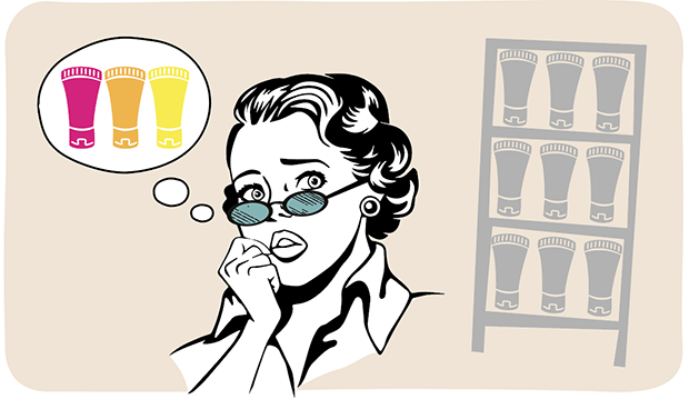
That’s far from always the case. In many many cases you create a great design only to discover that it comes out of the printer looking like crap, or not at all because it’s impossible to print.
-Whaaaaat? That’s very pessimistic, you say. Surely the design agency knows the print requirements and makes sure the design proposals are checked for printability before they're presented.
Nope. If you look at the agency’s excel project schedule, there’s a small colored cell saying ‘printability check’ at the far end of the plan, right after ‘design approval’ or even after ‘final art’. Let me tell you once and for all with capital letters and in bold:
What can you possibly do when the design is already approved, and the printer comes back with ‘we can’t print this text in all four process colors’ or ‘this gradient will come out striped’. Time is up and the printer is waiting for the files yesterday.
So you put out fires. Do minor changes that make the design meh, but at least printable. Change the text color to black and replace the gradient.
‘Bummer, but what can we do?‘
‘Who knew?’
Hah!
And a really easy one at that.
Implement print management earlier. Provide the design agency with a print spec that they actually understand in the beginning of the creation phase, and have the design checked for printability continuously while being created. That way, the agency can create a great design within the print limitations and has time to make adjustments on the way instead of applying poor solutions at the end of the project due to lack of time.
Thin texts can usually not be printed using process inks, especially in flexo printing, due to a little something called misregistration. Worst is brown, which usually contains all four inks. There are exceptions though: one of the ‘dark’ process inks (Cyan, Magenta or Black) can be printed together with yellow.
Possible solutions: use a Pantone instead of process, or make the text wider.

Same here – soft, grayish shadows behind the product in the image won’t be smooth all the way. The rubber dots break and create that line that’s not supposed to be there.
Possible solutions: make the shadows shorter or use a light gray Pantone instead of process black. The line is still there, but less visible.

These and about a billion other know-hows are in the head of a proper, experienced and solution oriented print manager, and available to you if you want to avoid putting out the said, unnecessary, fires. All you need to do is to copy-paste that little Excel cell into the design development phase. And know the right people.
Happy designing and good luck!

FMCG (Fast-Moving Consumer Goods) companies often face challenges in managing product revision workflows due to the complexity and scale of their...

Given the whirlwind nature of product launches, where timing is critical and perfection is imperative, ensuring your artwork proofing process is...

In the fast-paced world of design and product development, creating effective design feedback loops is essential. It's not merely about refining...